Thursday, July 9, 2015

Atlantis

Way down
Under the ocean
 where I want to be
    -Donovan (Atlantis)
Six feet of water
in the streets of Evangenline
     - Randy Newman

Greetings
       When James Hanson says something, its probably worth listening.  Not only has been looking into these maters longer than most, but he is also willing to tell the unvarnished truth  see e.g Ballad of the sad climatoligists.
      So it was with some interest that I listened to an interview he gave in Australia earlier this year, which I found on Ecoshock).  Here is a transcript of part of it
"The paleoclimate evidence indicates the ice sheets are much more sensitive than the glaciologist, the modellers of ice sheets have indicated and furthermore we now have satellite data over the last 12 years that confirms that ice sheet disintegration is a non-linear process that should not have been surprising, and I have been saying that for 10 years, but now this satellite data confirms that.
The ice sheets are losing mass faster and faster with a doubling the of about 10 years. If that continues, we would get sea-level rises of several metres within 40 to 50 years."
Several meters?   40-50 years?
             This is not what I've been hearing from the IPCC, so it was kind of a rude shock.  But it turns out Hanson has been saying stuff like this for some time.  see here
           While the IPCC sees a sea rise in a gentle upslope,  Hanson sees it as accelerating much faster,..

Hansen sea level rise
(Global sea level rise since 1870. Image source: Dr. James Hansen.)
There may be some support for Hanson's view in recent work.  This from Robert Scribbler's blog (see below)
 For a recent study, headed by Shuang Yi and published on April 30 in Geophysical Research Letters provides evidence that, since 2010, annual rates of global sea level rise have shown a strong uptick. The study, entitled An Increase in the Rate of Global Mean Sea Level Rise Since 2010, notes:
The global mean sea level (GMSL) was reported to have dropped 5 mm due to the 2010/11 La Niña and have recovered in one year. With longer observations, it is shown that the GMSL went further up to a total amount of 11.6 mm by the end of 2012, excluding the 3.0 mm/yr background trend. A reconciled sea level budget, based on observations by Argo project, altimeter and gravity satellites, reveals that the true GMSL rise has been masked by ENSO-related fluctuations and its rate has increased since 2010. After extracting the influence of land water storage, it is shown that the GMSL have been rising at a rate of 4.4 ± 0.5 mm/yr for more than three years, due to an increase in the rate of both land ice loss and steric change.
In short, the study finds an average rate of sea level rise of 4.4 mm per year, or 30% faster than the annual rate from 1992 to 2009, during the period of 2010 to 2013."
    Sea level rise is a function  of both thermal expansion dues to increased temperature, and additional water flows dues to melting Glaciers.  Thermal expansion has been the major factor thus far, but by its nature is  generally slow.  Glaciers on the other hand, can melt rapidly. 
       It all comes down to doubling time.  But every exponential curve starts slow and accelerates.  It difficult at the beginning to see which curve the data is following.  It may be a slowly changing curve or a rapidly changing one.    Thus in one paper Hanson argues.
       The increasing Greenland mass loss ... can be fit just as well byexponentially increasing annual mass loss, a behavior that Hansen (2005, 2007) argues could occur because of multiple amplifying feedbacks as an ice sheet begins to disintegrate. A 10-year doubling time would lead to 1 meter sea level rise by 2067 ... 2045 ... for 5-year doubling time and 2055 ... for a 7-year doubling time.

Obviously we are not preparing for such rapid sea rises.   And it could mean a loss of a lot of coastal property.  See Here  One aspect that I hadn't given much though to, however, is the impact on commerce - the impacts on ports.
   Just to get a feel for how much goes through ports, here is what wiki says
American ports are responsible for moving over 99 percent of the country's overseas cargo.
U.S. ports handle a wide variety of goods that are critical to the global economy, including petroleumgrainsteelautomobiles, and containerized goods. Reports from individual ports indicate that approximately 4.6 million automobiles (imports and exports) passed through American ports in 2006.

The impacts of sea level rise to ports could be significant.  For instance one EPA report states.

The U.S. Department of Transportation (U.S. DOT) initiated another effort to examine the risk to transportation infrastructure from climate change along the Atlantic coast. The study is identifying the transportation infrastructure that, without protection, will regularly be inundated by the ocean or is at risk of periodic inundation due to storm surges. Phase 1 of the report, covering Washington D.C., Maryland, North Carolina, and Virginia, was released in December 2007. In the state of Maryland, the study found that 28% of port acreage would be regularly inundated or at risk of periodic inundation if sea levels rose just 6 cm (2.4 inches)

However the Gulf Coast ports are more significant to the national economy. Noaa points out

"Along the Northern Gulf Coast, an estimated 2,400 miles of major roadway and 246 miles of freight rail lines are at risk of permanent flooding within 50 to 100 years as relative sea level is expected to rise in the range of 4 feet (Figure 1). The Gulf Coast is particularly at risk to service disruptions due to a transportation network that is interdependent and relies on minor roads and other low-lying infrastructure. The Gulf Coast is home to seven of the ten largest commercial ports (by tons of traffic) in the country. The region also hosts a significant portion of the U.S. oil and gas industry, with its offshore drilling platforms, refineries, and pipelines. Roughly two-thirds of all U.S. oil imports pass through the Gulf. Sea level rise would potentially affect commercial transportation activity valued in the hundreds of billions of dollars annually through inundation of area roads, railroads, airports, seaports, and pipelines (U.S. Global Change Research Program, 2009). Figure 1 shows the Gulf Coast area roads at risk from sea-level rise.


EPA says
"Looking particularly at the impact of storm surges, the Gulf Coast Study determines the percentage of marine transportation facilities in an area from Mobile, AL to Galveston, TX that would be affected by certain levels of storm surges. The study predicts that relative sea levels in the region will rise between 0.3 and 7 feet, depending on location, over the coming century. Average temperatures in the region are likely to increase between 0.9°F and 4.5°F over the next fifty years.11 The study provides probabilities for some impacts at the regional level. For example, if relative sea levels rise 4 feet, 72 percent of ports in the region will be at least partially inundated.
So, Hanson's conclusion looks pretty accurate.  
"So spell that out for us James before we move on, sea level rises of several meters in forty years, what would that look like in terms of our lives
The consequences are almost unthinkable. It would mean that all coastal cities would become dysfunctional, some parts of the cities would still be sticking above the water but they would not be habitable, so the economic implications are incalculable. We really cannot go down that path, this is an issue of intergenerational injustice.   It’s a moral issue because the current generation is burning the fossil fuel and getting the benefits and creating a situation that for young people, our children and grandchildren and future generations is going to have enormous consequences."


For an interesting interactive map of pontential flooding, see here 


Global Sea Level Rise Going Exponential? New Study Records Big Jump in Ocean Surface Height

From about a thousand years ago through to the mid 19th Century, global sea levels remained remarkably stable. Together with overall global temperatures, sea surface heights stayed at about the same levels until the late 1800s. At that time, an initiation of large-scale burning of oil, gas and coal dumped heavy volumes of greenhouse gasses into the atmosphere. The Earth System began to warm and seas began a slow upward climb.
Hansen sea level rise
(Global sea level rise since 1870. Image source: Dr. James Hansen.)
At first, the pace of sea level rise was minor — only hitting about 0.8 mm per year. But then, by around 1925, the rate of sea level rise more than doubled to 1.9 mm per year. The oceans, which at first only slowly accumulated heat, began a long term warming which eventually extended through almost every depth and region. This pace maintained until about 1992 when the oceans again hit a higher rate of rise at around 3.1 mm per year — a pace that then included a small but ominously growing portion of glacial melt.
Now, it appears that global warming is again pushing sea levels to rise even faster. As, over recent years, a number of ominous indicators pointed toward yet another surge in ocean surface levels.
All over the world’s frozen regions, the great land glaciers — especially in Greenland and Antarctica — have been destabilizing. Melting, cracking, and clamoring as their gargantuan, mountain-like forms assembled in an ever-speeding march to the seas. This great rush of freshwater melt and ice is already causing an ocean-threatening slow-down of Atlantic circulation. And in the Southern Ocean surrounding Antarctica an ominous bulge of water near the southern polar zone became an indicator of an increasing rate of melt from some of the largest glaciers on Earth. A bulge that was 2 centimeters higher than the global average along melting and thawing Antarctic shores.
Global Sea Level Rise On Upward Curve?
Recently, the global sea level rise measure — AVISO — also took an unsettling leap. With satellite captures of the world ocean showing a strong surge in sea level rise throughout 2014 and into 2015. A spike that displays vividly as a hockey-stick like jog at the tail end of the measure below:
Aviso sea level rise
(Big spike in sea level rise plainly visible in the AVISO measure. Image source: AVISO.)
It’s an upward jump representing nearly a 1 centimeter spike in the rate of sea level rise over the past six months.
By itself, this jump in sea level would be something to worry over. But new findings paint an even starker picture. For a recent study, headed by Shuang Yi and published on April 30 in Geophysical Research Letters provides evidence that, since 2010, annual rates of global sea level rise have shown a strong uptick. The study, entitled An Increase in the Rate of Global Mean Sea Level Rise Since 2010, notes:
The global mean sea level (GMSL) was reported to have dropped 5 mm due to the 2010/11 La Niña and have recovered in one year. With longer observations, it is shown that the GMSL went further up to a total amount of 11.6 mm by the end of 2012, excluding the 3.0 mm/yr background trend. A reconciled sea level budget, based on observations by Argo project, altimeter and gravity satellites, reveals that the true GMSL rise has been masked by ENSO-related fluctuations and its rate has increased since 2010. After extracting the influence of land water storage, it is shown that the GMSL have been rising at a rate of 4.4 ± 0.5 mm/yr for more than three years, due to an increase in the rate of both land ice loss and steric change.
In short, the study finds an average rate of sea level rise of 4.4 mm per year, or 30% faster than the annual rate from 1992 to 2009, during the period of 2010 to 2013. For these, more rapidly rising, sea levels the study identifies clear causes. The first is an increasing rate of land ice loss. The second is what is termed as ‘steric change’ — a scientific phrase that both identifies ocean thermal expansion due to warming combined with changes in ocean salinity, which also impacts sea surface height.
The April 30 study did not include the more recent sea level rise spike now showing up in the AVISO measure. So, at least for now, sea levels do appear to be sliding up some rather dangerous curves.
Hitting the More Difficult Rates of Sea Level Increase
Such a jump has stark implications for sea level by end century. A 4.4 mm per year rate of rise would equal just less than half a meter of increased sea level within one Century. This compares to the previous rate of rise which would have resulted in a 1 foot global jump within a one hundred year span.
A jump of this kind was, however, predicted with sea level rise by end of this Centuryexpected to hit between 0.5 and 1 meters of increase in the IPCC measure and between 5 and 6 feet in US Coast Guard studies (most studies find a range between 3-9 feet for this Century). The 4.4 mm per year increase is rather ominous in that it already puts annual rates of rise in the IPCC mid-range. An early ramp up with fully eight and a half decades left to go in a Century that will certainly see substantial further increases in global heat accumulation.
Composite
(South Florida 6 meters of sea level rise before [left frame] and after [right frame]. Note that second image is an artist’s rendering based on flood analysis showing what a 6 meter sea level rise would look like for South Florida, should it occur. Image source: Tropical Audobon Society.)
Many planners use the IPCC measure or even more conservative indicators to prepare for sea level rise at their city, county and state shores. And the fact is these indicators may fall well short of reality at the coastlines. A stark circumstance that will become more and more difficult to manage as time moves forward.
Overall, a 2010 ramping in the rate of sea level rise is a bit soon. Similar further jumps leading up to potential worst case 1-4 cm per year levels would initiate a combination of dangerous impacts including untenable rates of rise for coastal regions, severe shocks to ocean circulation systems and overall ocean health, and potentially very dangerous impacts to the world’s weather. To this point Hansen’s paper entitled ‘Greenland Ice Sheet Mass Loss, Exponential?‘ is well worth a (re)read.
Similar Climate Conditions Saw 20 Meter Surges in Sea Level Due to Glacial Melt
With current greenhouse gas levels now in the range of 400-405 parts per million coinciding with substantial jumps in glacial melt and sea level rise, it may be worth taking a look back at times in the geological past when atmospheric heating conditions were similar to those seen today. The last time heat trapping gasses were seen at such high concentrations was at the height of the Pliocene warming 3-5 million years ago. That time saw temperatures in the range of 2-3 degrees Celsius warmer than Holocene averages. It was also a geological period that saw Antarctic and Greenland melt events that pushed seas up to 20 meters higher.
We are exceeding maximum Pliocene atmospheric CO2 thresholds at this time (well exceeding if you count in a 485 CO2 equivalent forcing from all greenhouse gasses added by human beings). And we will almost certainly enter Pliocene warming levels this century. So the melt pressure we are putting on the world’s ice sheets is likely to at least be in the 20 meter range for the (hopefully) longer term.

Labels: , , , , ,

Thursday, September 18, 2014

Paint it Black


I wanted to see it painted, painted black
Black as night, black as coal
     - Mick Jagger

Oh the pictures have been washed in black
Tatooed everything
     -Pearl Jam (Black)


    Greetings 

     Here are some stunning pictures of  the snow in Greenland, taken by Dr Jason Box.   He is not sure where the black dust is coming from, but he knows its not good.

   "Box gives the stunning stats: “In 2014 the ice sheet is precisely 5.6 percent darker, producing an additional absorption of energy equivalent with roughly twice the US annual electricity consumption.”

     Unfortunately recent measurements have shown that  the ice in both Greenland and the Antarctic are melting at an unprecedented rate

     Here's a fun idea.  Climate Change tourism!   

“Some people we met there were saying things like, ‘I want to visit Greenland before it completely disappears. I want to see polar bears before they are completely extinct,’ ” says Alban Kakulya, a photographer in Geneva who spent three weeks in Greenland in 2009. His photographs manage to capture the island’s otherworldly beauty as well as the incongruity of pampered, sneaker-clad cruise passengers milling around what was once regarded as a forbidding landscape.


Photo by Jason Box
Isn’t ice supposed to be white?
Photo by Jason Box
Jason Box knows ice. That’s why what’s happened this year concerns him so much.
Box just returned from a trip to Greenland. Right now, the ice there is … black:
Photo by Jason Box
Dark ice is helping Greenland’s glaciers retreat.
Photo by Jason Box
Photo by Jason Box
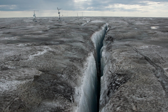
Crevasses criss-cross the Greenland ice sheet, allowing melt water to descend deep beneath the ice.
Photo by Jason Box
Photo by Jason Box
This year, Greenland’s ice was the darkest it’s ever been.
Photo by Jason Box
Photo by Jason Box
Box and his team are trying to discover what made this year’s melt season so unusual.
Photo by Jason Box
Photo by Jason Box
Box marks his study sites, appropriately, with black flags.
Photo by Jason Box
Photo by Jason Box
Box’s ‘Dark Snow’ project is the first scientific expedition to Greenland to be crowdfunded.
Photo by Jason Box


The ice in Greenland this year isn’t just a little dark—it’s record-setting dark. Box says he’s never seen anything like it. I spoke to Box by phone earlier this month, just days after he returned from his summer field research campaign.

 “I was just stunned, really,” Box told me.

The photos he took this summer in Greenland are frightening. But their implications are even more so. Just like black cars are hotter to the touch than white ones on sunny summer days, dark ice melts much more quickly.

As a member of the Geological Survey of Denmark and Greenland, Box travels to Greenland from his home in Copenhagen to track down the source of the soot that’s speeding up the glaciers’ disappearance. He aptly calls his crowdfunded scientific survey Dark Snow.

This year was another above-average melt season in Greenland.

Courtesy of The National Snow and Ice Data Center

There are several potential explanations for what’s going on here. The most likely is that some combination of increasingly infrequent summer snowstorms, wind-blown dust, microbial activity, and forest fire soot led to this year’s exceptionally dark ice. A more ominous possibility is that what we’re seeing is the start of a cascading feedback loop tied to global warming. Box mentions this summer’s mysterious Siberian holes and offshore methane bubbles as evidence that the Arctic can quickly change in unpredictable ways.

This year, Greenland’s ice sheet was the darkest Box (or anyone else) has ever measured. Box gives the stunning stats: “In 2014 the ice sheet is precisely 5.6 percent darker, producing an additional absorption of energy equivalent with roughly twice the US annual electricity consumption.”

Perhaps coincidentally, 2014 will also be the year with the highest number of forest fires ever measured in Arctic.

Box ran these numbers exclusively for Slate, and what he found shocked him. Since comprehensive satellite measurements began in 2000, never before have Arctic wildfires been as powerful as this year. In fact, over the last two or three years, Box calculated that Arctic fires have been burning at a rate that’s double that of just a decade ago. Box felt this finding was so important that he didn’t want to wait for peer review, and instead decided to publish first onSlate. He’s planning on submitting these and other recent findings to a formal scientific journal later this year.

Arctic and sub-Arctic fires were more powerful in 2014 than ever recorded before.

Photo by Jason Box/NASA

Box’s findings are in line with recent research that shows the Arctic is in the midst of dramatic change.

A recent study has found that, as the Arctic warms, forests there are turning to flame at rates unprecedented in the last 10,000 years. This year, those fires produced volumes of smoke and soot that Box says drifted over to Greenland.

In total, more than 3.3 million hectares burned in Canada’s Northwest Territories alone this year—nearly 9 times the long term average—resulting in a charred area bigger than the states of Connecticut and Massachusetts combined. That figure includes the massive Birch Creek Complex, which could end up being the biggest wildfire in modern Canadian history. In July, it spread a smoke plume all the way to Portugal.

In an interview with Canada’s National Post earlier this year, NASA scientist Douglas Morton said, “It’s a major event in the life of the earth system to have a huge set of fires like what you are seeing in Western Canada.”

Box says the real challenge is to rank what fraction of the soot he finds on the Greenland ice is from forest fires, and what is from other sources, like factories. Box says the decline of snow cover in other parts of the Arctic (like Canada) is also exposing more dirt to the air, which can then be more easily transported by the wind. Regardless of their ultimate darkening effect on Greenland, this year’s vast Arctic fires have become a major new source of greenhouse gas emissions from the thawing Arctic. Last year, NASA scientists found “amazing” levels of carbon dioxide and methane emanating from Alaskan permafrost.

Earlier this year, Box made headlines for a strongly worded statement along these lines:

That tweet landed Box in a bit of hot water with his department, which he said now has to approve his media appearances. Still, Box’s sentiment is inspiring millions. His “f’d” quote is serving as the centerpiece of a massive petition(with nearly 2 million signatures at last count) that the activist organization Avaaz will deliver to “national, local, and international leaders” at this month’s global warming rally in New York City on Sept. 21.

Future Tense is a partnership of Slate, New America, and Arizona State University.

Eric Holthaus is a meteorologist who writes about weather and climate for Slate’s Future Tense. Follow him on Twitter.

Labels: , , , ,

Friday, August 22, 2014

Greenland and Antarctic maps reveal “unprecedented” ice loss


Cold as ice
Someday you'll pay the price
    - Foreigner

I have lived here before, the days of ice,
And of course this is why I'm so concerned,
And I come back to find the stars misplaced
and the smell of a world that has burned.

      -Jim Hendrix

Greetings

      Interesting goings on up in Greenland.  Ice is  melting.   (see below from Carbon Brief) This, of course is somewhat concerning, as it will "eventually" result in a problematic sea rise.

    As usual with climate science, this recent melting is proceeding "faster than anticipated".  And it seems to be accelerating.  As reported by Robert Scribbler

   "It was an extraordinary rate of melt now 4.7 times faster than in the period from 1997 to 2003 and 2.5 times faster than during 2003 to 2009. But, likely, it is but one more milestone on the path to even faster melt."
    
     What does this mean?


   Perhaps its useful to look at at the geologic record .  Here's a summary from a new report from David Spratt, author of Climate Code Red

  • "During mid-Miocene climatic optimum  [16-14 million years ago] CO2 levels were similar to today, but temperatures were ~3–6C warmer and sea levels 25 to 40 metres higher than at present… When CO2 levels were last similar to modern values (greater than 350 ppmv to 400 pmv), there was little glacial ice on land, or sea ice in the Arctic, and a marine-based ice mass on Antarctica was not viable… Lower levels were necessary for the growth of large ice mass on West Antarctica (~250 to 300 ppmv) and Greenland (~220 to 260 ppmv)" (Tripati, Roberts et al., 2009).
  • “We estimate sea level for the Middle Pliocene epoch [3.0–3.5 million years ago] – a period with near-modern CO2 levels – at 25±5 metres above present, which is validated by independent sea-level data” (Rohling, Grant et al., 2009).
  • Likewise, “during the middle-Pliocene … we find sea level fluctuations of 20-40 metres associated with global temperature variations between today’s temperature and +3°C” (Hansen, Sato et al., 2013).

 
   But of course, humans,  being creatures with hyperbolic discount rate, we aren't that concerned about events that might happen at the end of the century, but do worry about things in our lifetime.   Our first question is ; When?

     It seems the future is coming at us at an accelerating rate.   Back to Robert:

"It is likely that mass rate losses will continue to increase until some kind of break or negative feedback comes into play. Similar rates of melt increase would mean an annual 5-8 millimeter sea level rise by 2035 due to Greenland and Antarctic melt on top of a 2-3 millimeter sea level rise from thermal expansion of the oceans and from other melt sources. But even taking into account the cooling effect at the ocean surface from ice melt and fresh water floods, one could easily envision the feared 1-3 foot sea level rise by sometime near mid century and the even more concerning 3-9 foot sea level rise amidst a very intense battle between hot and cold weather systems through to century’s end."


Fun facts about sea level rise from here:

• Thirteen of the world’s 20 largest cities are now located on a coast.
• Nearly 25% of the world’s population lives within 62 miles (100 kilometers) of a shoreline, and this figure is likely to increase to 50% over the next 25 years as people flock to coastal cities.
• More than 600 million people live in coastal regions that are less than 10 meters above sea level.
• Two-thirds of the world’s cities have populations of five million or more living in at-risk areas that are less than 10 meter above sea level. (Source)
• Thirteen of the world’s fifteen largest cities are on coastal plains. Many smaller cities, such as Alexandria, Egypt’s ancient center of learning, also face a severe risk of inundation with a 39-inch (1m) rise in sea level. 
• Low-lying coastal regions in developing countries such as Bangladesh, Vietnam, India, and China have especially large populations living in at-risk coastal areas such as deltas, where river systems enter the ocean. Both large island nations such as the Philippines and Indonesia and small ones such as Tuvalu and Vanuatu are at severe risk because they do not have enough land at higher elevations to support displaced coastal populations.
• Some island nations risk the danger of losing their fresh-water supplies as sea level rise pushes saltwater into their aquifers. For these reasons, those living on several small island nations (including the Maldives in the Indian Ocean and the Marshall Islands in the Pacific) could be forced to evacuate over the 21st century. (Source)
• With sea level projected to rise at an accelerated rate for at least several centuries, very large numbers of people in vulnerable locations are going to be forced to relocate. If relocation is delayed or populations do not evacuate during times when the areas are inundated by storm surges, very large numbers of environmental refugees are likely to result. (Source)

For visual representation of such a rise see here.    

-------

Greenland and Antarctic maps reveal “unprecedented” ice loss


A series of maps published this week show Greenland and Antarctica are losing more ice than at any time since satellite records began.
Scientists found the two vast ice sheets are losing a total of 500 cubic kilometers of ice per year, contributing to rising global sea levels.
Ice loss
The researchers used data from the European Space Agency's CryoSat - a satellite that passes over the earth at 700 kilometers above the surface and measures the thickness of polar ice.
The satellite was launched in 2010 and has been collecting data on sea ice and ice sheets ever since. By comparing data with other satellite missions, scientists can see how quickly the ice sheets are changing.
The study, just published in the journal The Cryosphere, reveals that since 2009, the volume of ice loss has tripled in West Antarctica and more than doubled in Greenland. This is the highest rate of ice loss since satellite records began 20 years ago.
Regional differences
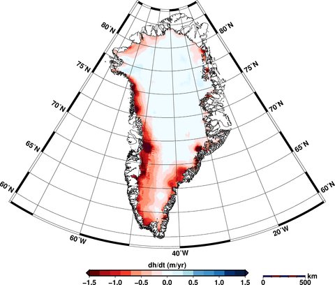
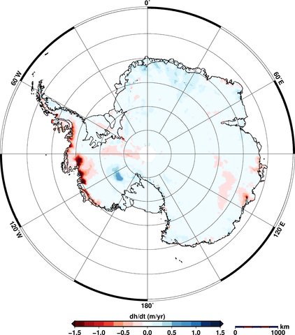
The maps show that Greenland is losing around three times more ice than Antarctica, including thinning of the entire western ice sheet and further losses in the southeast and northwest ice sheets. You can see where the greatest losses of ice are occurring in the red areas in the maps below.
In Antarctica, the maps show thinning of the West Antarctic Ice Sheet and the Peninsula. East Antarctica shows some increases in thickness (shown in blue in the maps), though this doesn't outweigh the losses elsewhere. Overall, more ice is being lost than gained.
The Cryosphere _Greenland Elevation Change _Aug 14

The Cryosphere _Antarctic Elevation Change _Aug 14
Elevation changes in Greenland (top) and Antarctica (bottom) between January 2011 to January 2014. Areas in red show loss of ice; blue shows gains. Source: V. Helm et al.(2014)
Satellite measurements
CryoSat collects data at 200 million points in Antarctica and 14.3 million in Greenland, as aBBC article today notes. Satellites can measure ice sheet heights by firing a radar pulse at each point and recording the time it takes for the signal to bounce back.
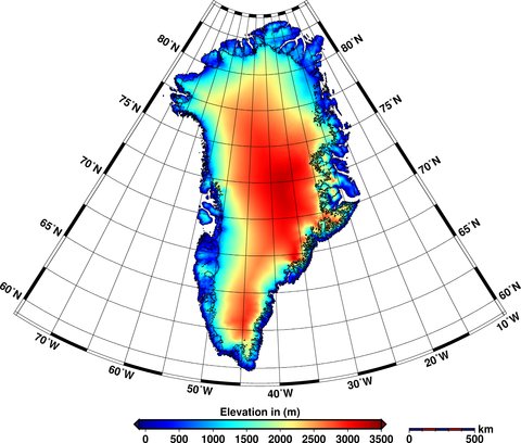
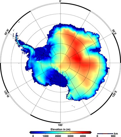
The data is used to create digital elevation models that provide a 'snapshot' of the state of the ice sheets covering the two land masses. You can see how the ice thickness varies over the surface of the earth in the figures below. The areas in red show thicker ice towards the middle of the land mass and the blue areas show the thinner ice around the edges.
The Cryosphere _Greenland Elevation _Aug 14

The Cryosphere _Antarctic Elevation _Aug 14
Elevations of ice in Greenland (top) and Antarctica (bottom) in 2012. Red shows areas of thicker ice; blue shows thinner ice. Source: V. Helm et al. (2014)
New imagery
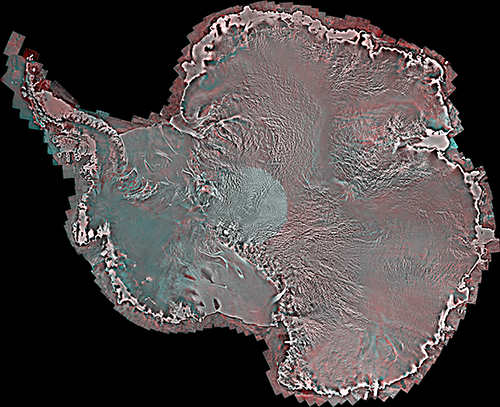
These aren't the only new satellite images to be released this week. A Canadian collaboration, including the University of Waterloo and the Canadian Space Agency, released a satellite 'mosaic' image of the whole of Antarctica.
The image, shown below, is made up from over 3,000 satellite images taken in 2008.
Uni Of Waterloo _Antarctica Image _Aug 14
Mosaic satellite image of Antarctica. Source: University of Waterloo
Yesterday's Mail Online covered the new research, featuring some of the satellite's images - such as the one above - including a close-up of an individual ice shelf.
The team behind the image also produced an equivalent version from images taken in 1997 and hope that being able to compare the two could help scientists identify changes in the ice sheets over Antarctica.
The next steps for the team include providing more regular updates to the Antarctic image, and creating a similar mosaic image for Greenland.

V. Helm, A. Humbert, and H. Miller (2014) Elevation and elevation change of Greenland and Antarctica derived from CryoSat-2, The Cryosphere, doi:10.5194/tc-8-1539-2014

Labels: , , , , , ,